Tuesday, 13 March 2012
Friday, 9 March 2012
Forms and conventions?
Forms and conventions are an important element used within the industry when producing media material such as music videos. One media form in which we found that we would need to include in the music video was the showing of all the band members to show the band and who was the group to present the band as they are new to the industry (as given on the brief).
Split screens seemed to be a key element in music videos that had the genre of R ‘n’ B/pop. This split screen effect allowed the audience to see all of the band members on their own as an individual on a separate screen. One of the artists already in the industry in which I researched due to her being involved in
R ‘n’ B/pop was ‘Beyonce’ a popular female artist; her music videos included split screens of her in different outfits (which I felt would work very well in a girl group music video. We developed the different shot ideas such as split screens, extreme close up of lips, long shots of all girls and a match on action shot; these shots we felt were very typical of a classic ‘pop’ genre music video.
Another theme in which seemed to be seen as a main convention of the
pop/ R ‘n’ B music genre was a colour scheme that linked to the genre. For example, pop genre videos seemed to involve bright, bold colours; whereas, R’n’B seem to base the music video convention theme on dark colours with an urban presentation such as black, grey and white. We felt that due to this we could perhaps combine the two which we did in the end with the red, black and white scheme into our video, linking to the ideology of the band.
How did you use new media technologies in the construction and research, planning and evaluation stages?
How did you use new media technologies in the construction and research, planning and evaluation stages?
New media technologies were very helpful throughout the project; they helped through the research, the filming stage, the editing and the feedback. The research was found mainly on the internet on the websites Google and Youtube, especially when it came to trying to find examples of the chosen genre and the research for looking at the codes and conventions used in a music video by other music video directors, this information was then all documented on my blog laurasa2musicvideo.blogspot.com.
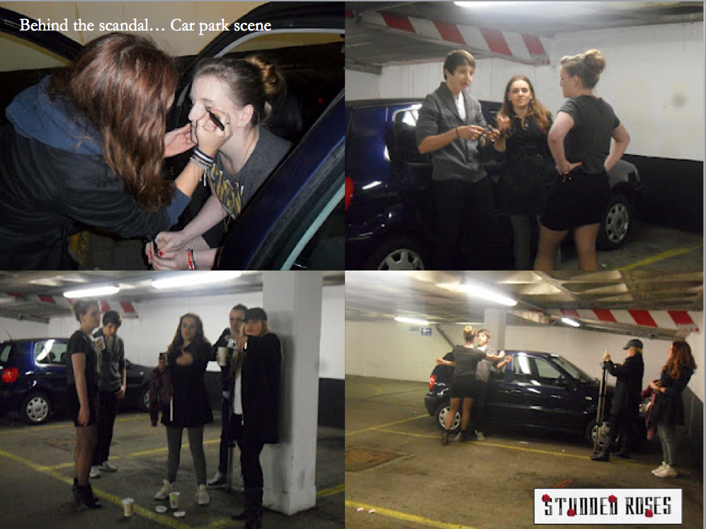
The filming was also used on new media technology such as a ‘Flip’ camera, allowing the filming to be done portably. This also allowed us to do a variety of different angled shots as the camera didn’t way us down and was easy to move around changing shots. Phones were also used throughout the filming of the music video, especially in the car park location due to the listening and playing of the song to film the lip syncing scenes.
The editing was then all developed on the Mac’s on the film making program, ‘Final Cut Pro’, this program allowed us to produce the music video once the video footage was uploaded. We were able to then add the music with the footage, were editing, cutting, changed and adding effects to the videos to create the final piece.
When having to evaluate the work and collecting feedback about what others, including our target audience thought about our final version of the music video, we felt that Facebook was the main site that would help us collect this information. We uploaded the video as a Quicktime video to youtube and then posted the link on each of your Facebook walls to see what people felt about the video. We also added the link to Twitter and sent it to one of the original band members of Misteeq who sung the ‘Scandalous’ song originally. She then retweeted this link saying she found it very impressive showing that we sent the link from the use of the internet, helping with the feedback process.
How effective is the combination of your main product and ancillary texts?
When looking through the different products in which I had created such as the main product of the music video and the ancillary texts of the digipack and poster there were a variety of thoughts about the combination.
The music video, I felt was overall successful as a whole due to the codes and conventions used. The mise-en-scene I believe helped with this success as it made the video come across as being more professional. An example of this is the colour scheme, the black, red and white theme; which allowed the music video to have the slight effect of being more planned and organised as being consistent. The colours also had the connotations of being perhaps being rebellious and maybe the idea of danger, which we wanted to use as the narrative was about the girls kidnapping the boy at the beginning of the music video and then the crime wall at the end which showed them being arrested, generally representing the idea of them being ‘scandalous’ in the music video.
Another element I felt worked very well in the music video was the locations used, including the car park, the crime wall, the red wall and the street scene. These locations seemed to make the music video more professional, allowing more of a narrative to progress. However, one of the weaknesses of the video I felt personally was the understanding of the narrative to some as it wasn’t always easy for people to understanding what was happening in the video due to mainly the absence of the boy as the music video continues.
The theory of Goodwin was used throughout our music video as we planned around his key elements:
1.Relationship between lyrics and visuals
2. Genre characteristics
3. Relationship between music and visuals
4. Influence of record label and use of close ups
5. References to the notion of looking/voyeurism
6. Intertextual References.
The relationship between lyrics and visuals seemed to be a strong factor throughout as we planned that it would allow the video to progress more present one of the conventions in which pop/R ‘n’ B genre music does in other videos. An example of this is the continuous cut shots of different band members singing the lyrics by lip syncing. Another theory from Goodwin was the relationship between visual and music, the link of the music and the way in which the visual changed with the music itself made the video link up better. As a group, we decided from the beginning that it was a key element that we must include in the music video. We did this by mainly basing the changes of the shots and scenes with the change of the music, we also did this when the lyrics such as, ‘So, so, so scandalous’ was said, the split screen shots would appear at the time of the music change.
We also tried to include an intertextual reference to the video, we researched a variety of different products in which we felt the target audience would be interested in, in this case we felt that make up would be a very good intertextual reference. This was then researched and I found that Rimmel had created a ‘scandalous’ mascara, we felt that this would be a very good reference for the music video. I found the commercial and decided to try and find a key scene in which we could take from the commercial and then add to the music video in some way. When we thought of this we decided to create a scene with a crime measuring wall whcih was used in the commercial with the model wearing the mascara at the beginning; we also started the video with one of the band members putting on the mascara at the beginning of our own music video.
When it came to creating the digipack design for the coursework project, I wanted to link the music video with the design of the digipack. Due to this I decided to find an image in which I could use as a representation of the word ‘scandalous’, when doing this I felt that as a crime based scene was used, crime scene tape would work well as an image on the digipack itself as a connotation. I then started to think about the presentation of the band members as they wasn’t an established group, meaning all images of the band members had to be included. I decided to take four different images of the girls and add them along the tape of the crime scene. When I did this I used Photoshop to cut the images out individually and then edit with effects, this developed into making the images black and white as I wanted to keep the theme of black, red and white but in different outfits to show variety.
Naming the tracklist on the digipack was another element that needed to be added to the digipack that linked to the video. I wanted to base the song names on the theme of ‘scandalous’ linking them all to having a scandal theme with girls taking control.
The logo was a strong element to the development of the music video promotion to represent the music video and print based media. When producing the logo we wanted the typography to link to the band. This included edgy and straight typeface so that there was a connotation of the bands ideology; strong and in control. Then studs were added in the lettering to link to the name of the band as well as adding roses to the edges of some on the lettering.
Then, when it came to creating the promotional poster, I used the same image which I used for the front cover of the digipack. Keeping the theme of black, red and white, I made the images of the group members black and white again but then made the lips red, having a connotation of the girls being dangerous or even a sexual theme. The logo was then added and name of the album, including the release date; in this case Valentine’s Day as we felt it would link to the name of ‘Studded Roses’, as roses are commonly associated with Valentine’s Day itself. As it was a promotional poster for the digipack, I researched the different logos that needed to be added, I decided to add these onto the bottom of the poster as a base bar, which consisted of: copyright logo, DVD logo, HMV logo, CD rom logo and the website of the group. I found that both ancillary texts and the main product came out very similar as a whole and all linked to each other through different elements explained, allowing the combination of them all matching.
What have you learnt from your audience feedback?
What have you learnt from your audience feedback?
Throughout the process and development of making the music video, we had time periods in which allowed us to view our work to the class through its development, allowing us to improve the video as we went along. From the first class showing we learnt that the music video was a bit too slow with pace due to the beat and general content of the song, this made us edit the video and make the footage move on the timeline faster, allowing the clips quicker with the beat of the song (Goodwin’s theory).
When it came to the class viewing of the final version of the ‘Scandalous’ music video, the feedback in which we received was overall positive, this included the mise-en-scene, costume, concept, the performance and the variety of camera shots used. The things in which we were told could be improved on was the narrative with the boy as some didn’t understand where he went as he was only used once in the video, allowing us to add a new piece of footage of him in it so it could possibly be understood better. Another element in which people felt could be changed was the ending with the crime wall as people felt it was too long, due to this we cut down the ending approximately a minute so that the scene was shorter. Overall, I found the audience feedback very helpful as it allowed the group to see different people’s views of the video included different genders and ages so there was a mix of ideas that came when feedback was given.
Monday, 5 March 2012


Tuesday, 28 February 2012
The Feedback of the music video...
Firstly we decided to upload the final version of the video onto the social networking site, Facebook as we felt that it would be able to be visible to a variety of different ages so that there would be a different target audiences commenting to see who it attracted to the most...


From this we found the feedback from Facebook interesting as one of the comments was very detailed and allowed us to have a clear understanding of someone else's view of the music video.
After we then used the other social network of Twitter, we twitted one of the original band members of Misteeq (the band which originally sung the song), she then retweeted the link of our video so that more people were able to view it and get feedback from...

Friday, 24 February 2012
Powerpoint of the Final Digipack design
Final Digipack development
This is the final digipack design in which I have created. I have included all the main codes and conventions of a digipack in the design, remembering to include similar qualities of design from the music video.

This is the final digipack design in which I have created. I have included all the main codes and conventions of a digipack in the design, remembering to include similar qualities of design from the music video.

Thursday, 23 February 2012
Production Journal - 23rd February 2012


Today, we felt that it was time to complete the music video, touching up the final pieces that people felt we needed to change due to the feedback from others. We decided to watch the video for the final time and make the final changes, we sat with Amy as she edited the changes in which we felt needed to be deleted and changed.
Things that we changed in this time:
- We cut down the green screen, crime scene shots as we felt from the feedback that people thought it was too long.
- We added more shots of the boy throughout the video so people were now able to see more of a storyline of why the girls have been arrested.
- We also changed small parts of the video that we felt were out of sync and needed to be changed.
Feedback prezi
Today, we showed our music video to our Media class, this is the second time we have shown it to them. The first time they viewed it we was only half way through our editing. However, now we have come to the final stage of our editing. We also, showed our class our digipaks and posters in addition to our video. Generally the feedback was very positive but according to the feedback we received there are still some minor things we need to adjust. Below is a prezi I made on the feedback we received from our class.
The video shown to class as final before the FINAL touch up of the editing
Feedback after viewing of second-to-last draft
Below are the quotes people used to feedback their thoughts and feelings about the music video produced, these were taken on board after and we decided to use these to edit small parts of the video so that it was the final touched up version, this then is followed by the ways in which we are going to change the video because posting as the final piece.
Good Feedback:
- 'Really, really good'.
- 'Liked the car scenes'.
- 'Mise-en-scene good/appropriate to image trying to convey.'
- 'The colours used in the video: red, black and white.'
- 'Like the crime scenes'.
- 'The editing, speeding up the shots'.
- 'The fast pace walking to the camera'.
- 'Night scene with Laura, the lighting is good'.
The things that need to be improved for the FINAL VERSION:
- 'What happens to the boy? Never see him again in any shots after the car park scene with Amy'
- With this we decided that we would add the clip of the boy looking scared in the video when the girl group is coming towards the screen so that it could connote that they are taking control and he appears more so it's less of a mystery.
- 'Too much crime scene at the end'
- With this we are going to cut down some of the song towards the end so that the scene is shorter as people felt it went on for too long.
Monday, 20 February 2012
Feedback after pitch for first draft
These are the scanned feedback images from our class pitch of the first draft of our music video of Scandalous. The higher percentage of the feedback was positive and was helpful for our group to listen to as we were able to understand what people who haven't yet witnessed the video thought. There were still gaps in the video, including some black out shots and missing video but we wanted to show what we had made so far.
The feedback below shows evidence of what people rated and thought of our music video at the stage we was at.


Tuesday, 7 February 2012
Developing ideas...
The final effect we wanted to add to the music video was adding text to the video which linked to Goodwin's theory in which we previously researched at the beginning of the project. This was decided as we wanted to think of new effects in which could be added to the music video, we liked the idea of covering the screen with a variety of different texts and words across the screen throughout the music video so that the video would look more chaotic, linking to the representation of the group being 'scandalous'.
This then lead to the research of the music video of Rihanna, 'You do one', this video included text throughout that video in different fonts. These texts also included the relationship between lyrics and video due to the lyric words showing on the video when the song was being sung. We all really liked this idea and decided that this was the final effect that needed to be added to our music video before we could officially say it was finished.
The next stage of this we then decided was to start looking at different fonts and words in which we would add, including the designs that could then be added to the music video final piece.
Monday, 6 February 2012
The editing process
At this stage of the music video coursework, Megan has almost completed the editing of the video as we have given ourselves the deadline of the end of the week as we want to get it uploaded and finished. Megan is at the stage of tidying the music video up, making sure that the lip syncing to the music is all correct and that everything links to the music beat.

This included making sure that all the shots of the green screen images were tidy and all matched up with each other.


Remembering to include different shots in the music video, the decision of a split screen of each band member throughout the video was added.


The last thing in which needs to be done to the music video is to add the text and the beginning of the music video and that is the final stage of the music video.
Monday, 30 January 2012
Production Journal - 30th January 2012
In today's lesson, Megan continued to edit the music video where the green screen needed to be changed into the police height wall. This was going to be used so that the narrative of the music storyline has a conclusion, being that all four girls have been caught for kidnapping the male character. Once this is finished all we need to do is add the text at the beginning of the music video:
Studded Roses
Scandalous
Other examples researched:
Before adding this text I wanted to research how different bands/groups began their music video with text, if any. One band in which I found that included their group logo in the beginning of their music video was, 'The Wanted', who included it in every video of theirs...


However, as I started looking at different genres of music and a variety of artists, many music videos that included text at the beginning of the videos. These are some of the examples below in which I researched and print screened:
Nicki Minaj included fading text covering the whole screen in her video...

In One Direction's music video instead of including their band name at the beginning of their music video they added the director's name instead.

Labrinth ft Tinie Tempah's video consists of the title of the song and the artists name as an MP3 image in a car, relating to video.

Monday, 23 January 2012
Image for the greenscreen
While the video was being edited by Megan, I decided to start looking for the image in which we needed for the green screen scene with the band members with the crime boards. I wanted to put the white lined height wall behind us to replace the green screen.
When looking for this image, all the photos of Google had text, a person or a logo on so I decided to photoshop one of the larger images so that it was ready to be used for when it came to adding the image onto the green screen.
The is the image in which I photoshopped:

When looking for this image, all the photos of Google had text, a person or a logo on so I decided to photoshop one of the larger images so that it was ready to be used for when it came to adding the image onto the green screen.
The is the image in which I photoshopped:

About the digipack...

As I began to create my digipack, I brainstormed some words and environments that linked to the idea of being 'scandalous', when doing this crime was something I personally felt could link in really well. I wanted to think about adding a background that could represent this to the audience, leading to the crime scene tape. Next, I started thinking about the different codes and conventions as well as the elements that needed to be added such as the logo of the group, the tracklist, images of group, album title and disc design, not forgetting the logos of 'compact disc, DVD rom and Song BMG'.
When it came to thinking about colours in which I could use in the design, I decided that red and black would be the main colour scheme as when we were making the music video we decided that the members of the band would be wearing black and red the most as it is a connotation of danger, linking to the idea of being different which leads back to the ideology. Photographs of the band members was shown all across the digipack so that there would be more establishment to the new created group.
Tuesday, 17 January 2012
The editing...
Megan and Amy have been editing the footage in which we filmed of the music video of the girl group. We decided to use final cut pro as we felt that it would allow the video to have more effects in when editing than imovie would provide.


Monday, 16 January 2012
Making my promotional poster
When I began to create my poster design for the promotional advertisement for the girl group's digipack, I wanted the poster to have very similar features as the digipack itself. I decided to use the crime scene tape on the poster again like the cover of the digipack, as well as including all the group members so they could be established into the industry.
The process of making the poster: Experimenting with the effects of images.

Continuing the process: Deciding what colour the images would be and adding the red lips.


Continuing the process: Deciding what colour the images would be and adding the red lips.

THE FINAL PROMOTIONAL POSTER

Tuesday, 10 January 2012
Production Journal - Update of where we are at.
Tuesday 10th January 2012:
Where am I at the the moment?
In this coursework section of the course, I have currently completed my digipak design for the girl band as well as beginning the creation of the advertisement for the band for promoting the new digipak into the music recording industry for the band.
'The Saturdays' example:


'The Saturdays' example:
I decided to look at the girl band, 'The Saturdays' promotional poster as an example as I felt that they generally linked to our girl groups target audience. I realised that the main elements used in it was: the group main image, album release date, website and band logo with that name of the album (in my case the digipak).
'Rihanna' example:
When looking at the Rihanna album promotional poster I felt that it would be good looking at hers, as her album is about being unique to other artists. I found when looking at her promotional poster, it included: the main poster again, the artist herself's logo, the album name and the music recording logo.
Monday, 9 January 2012
My Final Digipak

This is my final design of the digipak, overall I felt that it was successful as it in had the connotations linking to the groups ideology shown through the images and the colour scheme. I also felt that it showed a clear understanding who was in the band, establishing the girl group into the music industry. I made sure that I included all the right logos and symbols as well such as: the DVD logo, Compact disc logo, copyright and the record label logo.
The digipak creation process.
These are some of the screen shot images of the digipak of when I was creating it and designing it, I started with one side first, making sure it was completed before I moved on to the other side. I decided to add photographs of each member of the group holding a crime board to be a connotation of the group going against others.

Then, I began on the disc designs, I felt that as there was much link to the group name, 'Studded Roses' in the first three sides in which I had done, I felt that I would design the discs made of images from roses, remembering to also add the logo and what disc number it is.

After, it came to the final stage, adding the wallet pocket for the leaflet from the digipak to be added. I also added the information of what was on each disc and an image of the girl band altogether.

Production Journal - 17th January 2012
At this stage in the project we are all at the point of making digipacks and posters for the individual pieces. We are currently at the stage of editing the music video with all the shots involved in which we felt worked the best, we are at the stage of also filling any gaps that we felt needed to to filled as well.


Subscribe to:
Posts (Atom)